This is my final portfolio. Enjoy.
This year was great. This class was amazing and very helpful. I learned many things from how to use Lightroom and Photoshop to composition techniques. Every project was fun and full of valuable experience. My favorite project was probably the surrealism project. I really enjoyed using photoshop and learning about all it's tools and stuff. I am going to be sad once I leave this class because Photoshop and Lightroom are really expensive. I'd say my least favorite project was the HDR/sci-fi project, it was good idea but it just didn't work out for me. Overall, it was a great year.
Thursday, June 12, 2014

Thursday, May 29, 2014
Monday, May 12, 2014




Monday, April 28, 2014
Porject 9 Commercial Portrait, Magazine Cover
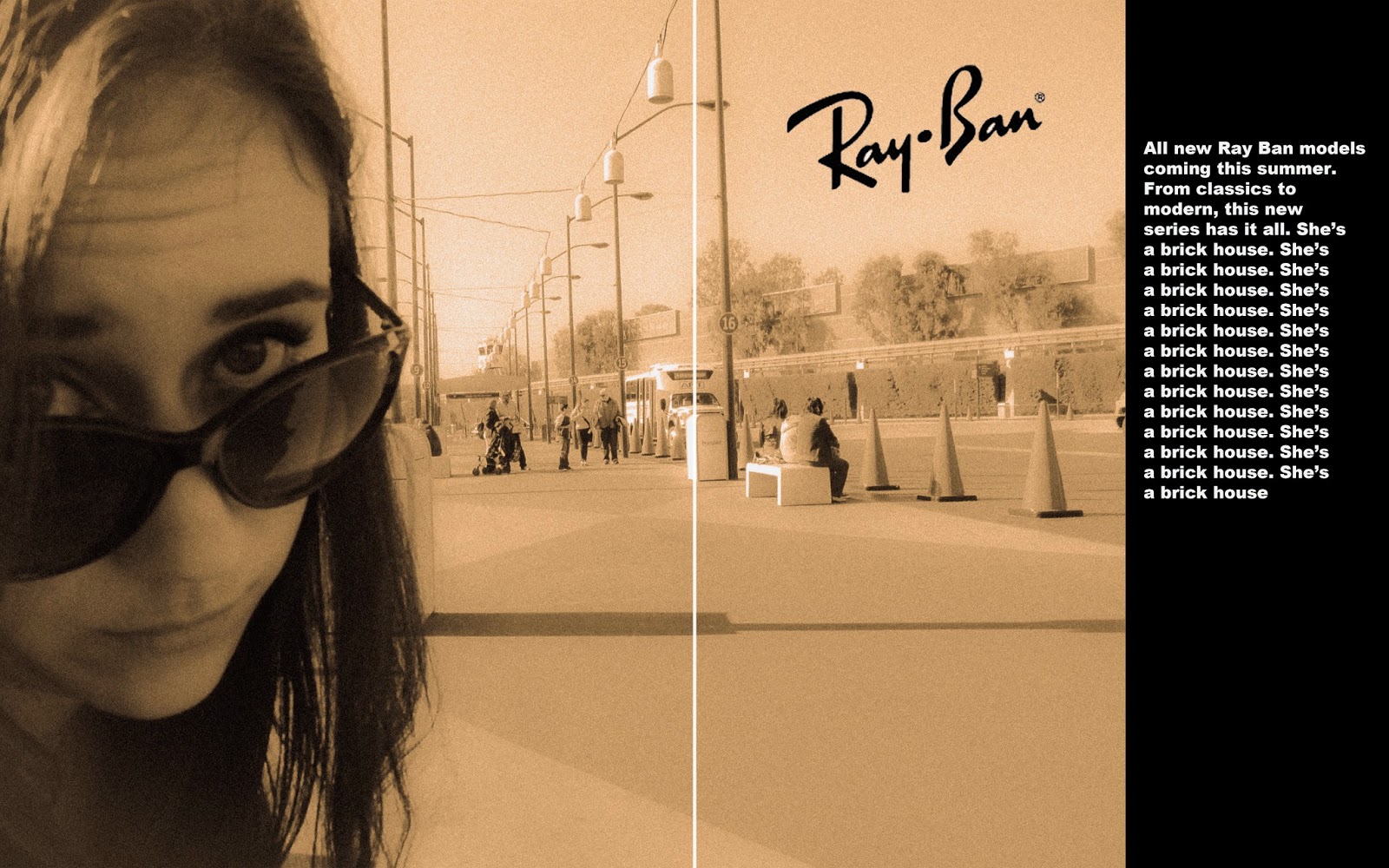
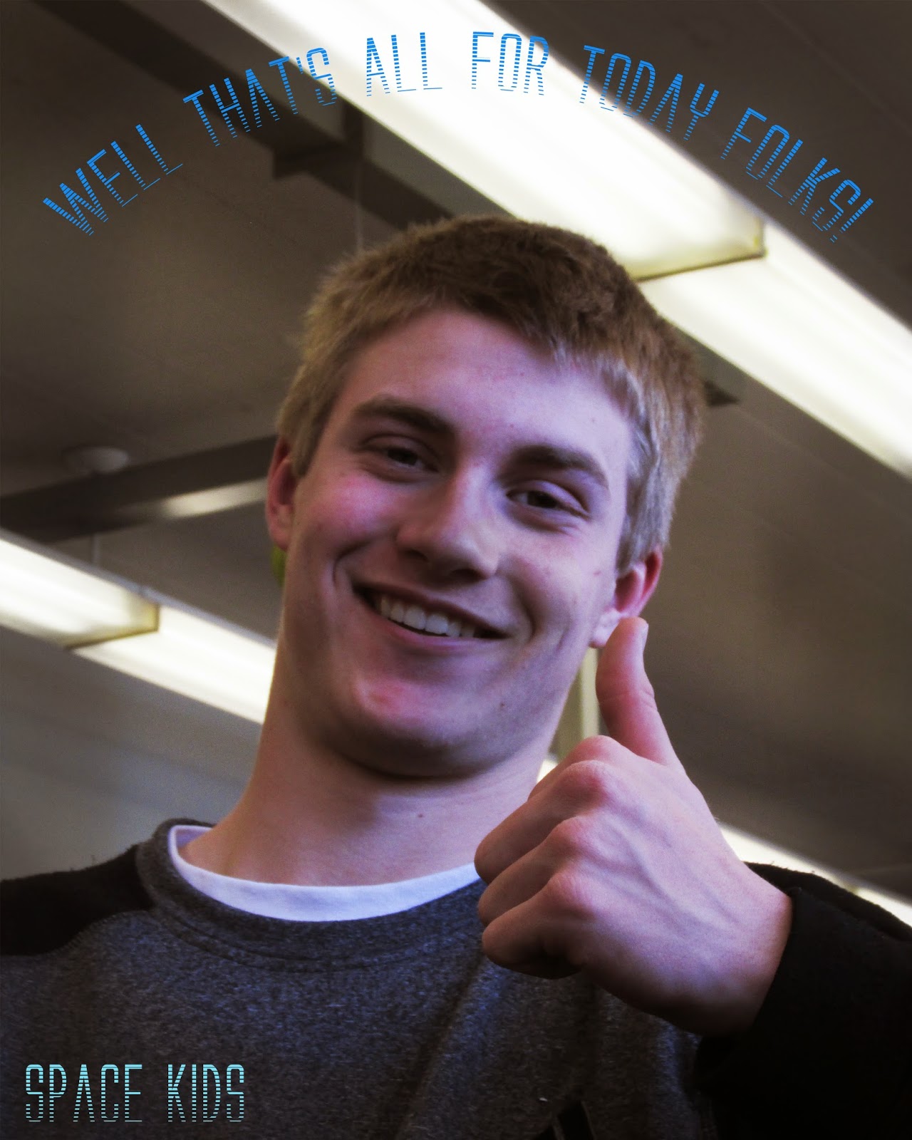
I made a few magazine covers. These photos were shot outside of Lincoln High School. I first used Lightroom to edit the brightness and contrast, as well as other aspects of the photos. Once in photoshop I was able to turn these photos into magazine covers. The 1st photo I tried to mostly capture the subject as he was posed against a telephone pole. I played with the lighting until I was happy. For the second cover, I took a more modern approach. As for the final cover, I just found this photo amusing and decided I will edit it.
 |
| Cover 1 |
 |
| Cover 2 |
 |
| Cover 3 |
Tuesday, April 1, 2014
Portraits
Commercial portraits/magazine covers and fine art portraits
 |
| Complex magazine. I like this photo because of the originality and editing of it. I like the how must of the colors are pretty light. The font of the text is appealing. |
 |
| Complex magazine. I really like the editing of this photo, it is also very original. The aren't too many colors, but is still appealing. The two colors contrast each other so the cover of the magazine is more flashy and fun to look at. |
 |
| Fine art portrait by Tejal Patni. The guy in this photo really stands out from the background and the yellow tennis racquet brings out the other colors even more. The photo is pretty dark which gives it a more serious tone. |
 |
| Fine art portrait by Jody Ake. This photo is a daguerrotypes. |
Project 8 Multiple Image Techniques
For this project we had to shoot an HDR photo, a multiple exposure photo, and a panorama photo.
 |
| Original |
 |
| HDR edit. The original photo was shot at a very long shutter speed and then copied 5 times, each photo set at a different contrast in photoshop. Then I changed the gamma correction and other things. |
 |
| Motion edit. To make this photo I shot multiple photos of the swing, in photoshop i compiled the swing photos into one. Each layer has a different opacity, giving it the impression the subject is moving. |
 |
| Panoramic. This photo was shot with an Iphone 4s. It was later edited in photoshop and lightroom. |
 |
| Original |
 |
| HDR |
Monday, March 3, 2014
Project 7 - Alternative Process Through Digital Means
For this project I had to make daguerrotype and cyanotype images. A daguerrotype is a photograph that is distorted to make it look really old. A cyanotype is just a photo with a blue tint.
 |
| Original |
 |
| Original |
 |
| Daguerrotype |
 |
| Cyanotype |
Tuesday, February 25, 2014


Thursday, February 6, 2014
Surrealism
Surrealism: a 20th-century literary and artistic movement that attempts to express the workings of the subconscious and is characterized by fantastic imagery and incongruous juxtaposition of subject matter
Andre Breton and Max Ernst are both very well-known artists from this movement.
 |
| Andre Breton |
 |
| Max Ernst |
Tuesday, February 4, 2014
Thursday, January 23, 2014
1st Semester Final - Emulation

Friday, January 10, 2014
Project 4 - Balance and Contrast.
For this project we went into downtown Portland to shoot photos. We focused on pictures that had a contrast in scale. color, and texture. We also made kaleidoscopes, diptychs, and triptychs. Photos were edited in Lightroom and Photoshop.
 |
| Flower kaleidoscope |
 |
| Face kaleidoscope |
 |
| Crow kaleidoscope |
 |
| Clock tower kaleidoscope |
 |
| Another flower kaleidoscope |
 |
| Water tower diptych |
 |
| Car triptych |
 |
| Seductive diptych |
 |
| People diptych |
 |
| Photographer triptych |
 |
| Berry triptych |
 |
| Contrast in color |
 |
| Contrast in texture |
 |
| Contrast in scale |
Thursday, December 19, 2013


Thursday, December 5, 2013
Project 3-Color and Grids
For this project we went into downtown Portland and took pictures of colorful things. Then I edited them where color and pattern are the main focus and put them into grids.
For this project we went into downtown Portland and took pictures of colorful things. Then I edited them where color and pattern are the main focus and put them into grids.
 |
| This is a 6x6 grid, using complimentary colors. Originally the photo was of two blue garbage cans and a red brick wall. I changed it so they were bright blue with an orange wall, and purple cans with a yellow wall. |
 |
| This 4x4 grid also using complimentary colors. The picture is of a plastic statue that was originally green. I rotated the photos to make it look like an LSD trip. |
 |
| This is 3x3 grid of photos I shot downtown. They all have the same editing job of a turquoise tint and a light grain. |
 |
| This is a 5x5 grid of the same shot of potatoes. I edited each row a different color to give it a rainbow effect. |
 |
| I really enjoyed working with complimentary colors so I created an extra 6x6 grid of photos with complimentary colors. This photo was originally red and blue. |
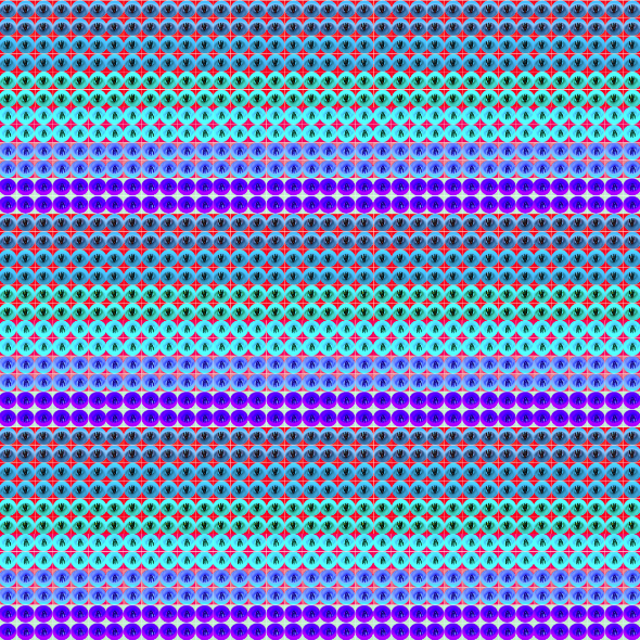 |
| For this I took the 6x6 grid above and copied it 36 times to make another 6x6 grid. I didn't want to make it complimentary colors so I used blue, light blue, and violet to make it a "cool" picture. I think it could be used as a fabric design. |
 |
| This is a picture of some leaves on the sidewalk, I made the reds and yellows a little brighter to make the picture warmer. |
Subscribe to:
Posts (Atom)