For this project we went into downtown Portland and took pictures of colorful things. Then I edited them where color and pattern are the main focus and put them into grids.
 |
| This is a 6x6 grid, using complimentary colors. Originally the photo was of two blue garbage cans and a red brick wall. I changed it so they were bright blue with an orange wall, and purple cans with a yellow wall. |
 |
| This 4x4 grid also using complimentary colors. The picture is of a plastic statue that was originally green. I rotated the photos to make it look like an LSD trip. |
 |
| This is 3x3 grid of photos I shot downtown. They all have the same editing job of a turquoise tint and a light grain. |
 |
| This is a 5x5 grid of the same shot of potatoes. I edited each row a different color to give it a rainbow effect. |
 |
| I really enjoyed working with complimentary colors so I created an extra 6x6 grid of photos with complimentary colors. This photo was originally red and blue. |
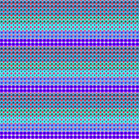 |
| For this I took the 6x6 grid above and copied it 36 times to make another 6x6 grid. I didn't want to make it complimentary colors so I used blue, light blue, and violet to make it a "cool" picture. I think it could be used as a fabric design. |
 |
| This is a picture of some leaves on the sidewalk, I made the reds and yellows a little brighter to make the picture warmer. |
No comments:
Post a Comment